Gif Advertisement Research

Firstly, I looked at some simple gifs created by some major sports brands. I feel like Nike do a great job of using gifs and using them to advertise their products. They like to use a lot of bright colours to match the different colour ways of their shoes. These colours help to draw attention to the gifs and get people to look at the shoe. They like to keep it simple with the use of frames and changing quickly between each frame to show off all the styles of shoes they offer. I feel as if this works because it isn’t too long or intricate which could cause the target audience to lose interest and it is also eye catching and a good, easy way to show off your products. Other brands also use this method because it allows them to quickly display their products and the different options.

NIKE KISS MY AIRS on Behance9 ridiculously good examples of kinetic typography | Inside Design Blog
Adidas Inovando com GIFLady Foot Locker: A day for you and your favorite kicks | MilledImage result for reebok gif

Time Based Artists Research

Time Based Art

Time based media is usually created and focused around technology and can be displayed in a video, film, slideshow, audio or anything else computer based. Artists create galleries which display their videos and the aim is to watch the art unfold over time. I like this form of art and animation because it gives the artist a different opportunity to display their work, compared to, a painting or photograph for example. Time based media is usually very unique and interesting to look at even though it is usually a still background and one act unfolding over a short period of time.

Bill Viola

I looked at some famous artists that have created time based art. The first person I looked at was Bill Viola. A lot of Bill’s work is focused around water due to the fact that he nearly drowned as a child. I am a fan of Bill’s work because he has varied from a comedy aspect to a serious aspect and has used people as a large form of his art. This gives a unique and life like feel to his art. One of my favourite pieces from Bill is called The Deluge which can be seen here: https://www.youtube.com/watch?v=t3VoMuwBPAE.

Image result for Bill viola the deluge

So much of Bill’s work involves water and it can sometimes get repetitive but he has used water in so many different ways that it is always different in some aspect. Bill also has a great way of explaining his work and the reasonings behind it. Another great piece from Bill is called Martyrs (Earth, Air, Fire, Water). This displays people or martyrs being effected by the 4 elements, which can be seen here: https://www.youtube.com/watch?v=1_ZcIoGeRIQ.

Image result for bill viola martyrs

Bill’s work, to me, feels like a moving painting or photograph because of the style in which he creates his work. This is with a still background and the use of people and other things moving to create the time based art.

Bruce Nauman

Another time based artist I looked at was Bruce Nauman, who was one of the first people to create time based media and make it a popular art form. He created time based art in the 1960s and one of his first pieces was called Performance Corridor which he released in 1968. A lot of Bruce’s initial time based art was created using his own body. This can be seen in pieces such as Wall-Floor Positions. In this piece he simply moves his body into different positions against a small area consisting of a wall and floor and he does this for around an hour.

Image result for bruce nauman wall floor

Bruce has some time based pieces which are based on the person viewing them. He firstly, created some pieces in which he videos himself moving through these small corridors in different ways. He then installed these pieces in galleries and allowed people to view and move through them. I like this because it is different from most time based pieces and can be affected by things such as light moving through the corridors and colours lights being projected throughout the corridors. The fact that you can experience these pieces for yourself is also what makes them unique.

Image result for bruce nauman corridorImage result for bruce nauman corridor

Tony Oursler

Tony Oursler’s work is more focused around people, their faces and distorting them to create his art. He uses projections and different shapes to distort his art. A lot of his work is similar in this way but is still unique from other forms of time based media. He has created music videos with David Bowie. which followed his projection style.

Image result for tony oursler david bowie where are we now

Image result for tony oursler workImage result for tony oursler work

Here you can see the style of Tony’s work. This is consistent throughout his work and he has the faces and peoples features moving. I do enjoy this style because it is eye catching and can also be humorous to look at.

Refik Anadol

Refik Anadol uses a digital style when creating his work and uses projections in rooms to bring a room to live. He also uses a distortion style and has still images moving and distorting to change into other images. I like this style of projection onto walls and floors as I have seen and enjoyed this style when watching NBA games. Before a game starts they project an animation onto the court which looks very striking and real. Refik has a similar style with his work but it is focused more around shapes and these shapes moving.

Image result for refik anadol

Image result for refik anadol

I feel as if this style of time based media is important because it is the way in which advertising and technology is moving. It is becoming more and more common and people like Refik help to pioneer and move this style in the right direction.


Final Evaluation – Unit 6

To start this unit I first, brain stormed some ideas for different types of brands that I could select and re-brand. For example: food and drink, computer hardware, software, clothing and more specifically sportswear and self-care products. I then looked into these different businesses to find some smaller brands which I could re-brand. Some of the companies I looked at were: Inkscape, Affinity Designer, Miranda, Rubicon, Lotto, Champion and some others. I was always looking towards a sport clothing brand so I researched these businesses more to try and find a smaller brand I could choose. After researching, I decided to choose Lotto as my brand. Lotto is a smaller Italian clothing brand which have a large range of sport clothing. They do still have more casual clothing but their main focus is on sport clothes so I thought it could work for my re-brand. I looked at some of their existing clothing and their branding and the clothing gave me some inspiration and a starting point for my brand ideas. I didn’t like the logo however because I feel as if it looks too dated and doesn’t appeal to a younger target audience. The main reason I wanted to select a sport clothing brand is because I wear mostly sport clothes myself. I felt as if I had some good ideas and good starting point for this rebrand because of my familiarity with these types of clothing. To finish my research, I created a PowerPoint which went over things such as: the definition of branding, aspects of branding, popular brand examples, target audience, competitors, packaging, ethical considerations and some other aspects.

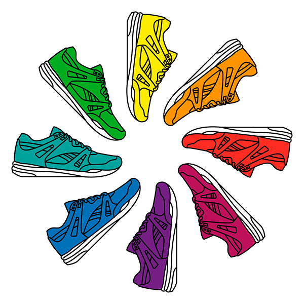
The first problem I encountered was, finding a brand which was small enough and suitable for me to re-brand. I looked at all of the options which I researched, this included: software, clothing and self-care products. As mentioned before, I was mainly focused on a sport clothing brand but I wanted to look at my other options and I also had a few ideas in mind for a software brand I could choose. This was Inkscape, a specific piece of graphic designer software. I just felt that it would be more difficult to create the logo and branding for a piece of software as the logo would have to be much more detailed. You are also limited in the packaging and would only be able to design a box which the disk comes in. This is why I felt clothing was the best for a rebrand because of the options for design. For example, I could create new t-shirt designs or shoe and shoe box designs. I also struggled with the logo design and colour scheme for my re-brand. I wanted a logo which had an icon that related to the name of the brand. This was because I wanted the icon to be used without text on some of my designs. I tried multiple different designs but eventually created one which worked. Also, for the colour scheme I selected blue shades and basic colours. However, I didn’t want to be limited to these colours for every design so I created a few designs in different colours to see what they could look like. Another problem was, deciding on what box style to use. I came up with some sketches and designs I could create using different styles of shoe boxes. For example, I could use a 2-box system which allows you to pull the box containing the shoes out from the first box. I then thought about adding designs to the inner box that are revealed when it is pulled out. I decided to go with a simple shoe box because it is the most popular type of shoe box and it is what is used by our largest competitors.

To begin planning for I created hand drawn mock-ups of my packaging and also hand rendered some initial ideas for the logo re-brand. I then furthered this by creating some designs in Photoshop to give me a better idea of how the final designs could look. This was also to give me some inspiration and ideas for my final designs. Using these mock-ups of the shoe boxes I created a final design for my shoe box then changed the colour to see which worked best. I created the multiple different colour variants then printed my favourite to use for my final box design. I created some hand rendered designs for my logo which I could scan in and use. I thought these could help add some more detail and uniqueness to my designs and can be used on the t-shirts and shoe designs.

Because this unit was focused around packaging, a lot of my work was done using InDesign. This is the software I have used at work to create packaging and I feel it is suited best for this. I also used Illustrator to create my logo so that they were vectors and able to be re-sized without losing any quality on the image. Illustrator was also used to create some designs which I could use on my shoe box. Finally, I used Photoshop to render some mock-ups of my shoe box and used tools such as: Hue/Saturation, overlay, layers and other tools. Using these programs always helps me improve and I learn new skills each time. It also helps to refine my existing skills. Photoshop isn’t one of the main software’s which I use at work so any chance I get to practice, research and learn new skills always helps.

The final design I selected was the one using the blue colour scheme. This was the initial colour scheme I selected and I thought it worked the best for my packaging. My peers agreed that this was their favourite design out of the 4 different colours I tried. However, my teacher liked the red design which I created and thought that I should also try this as my box design. I have printed both to see which I prefer once it is rendered into my final shoe box design. The first thing I struggled with was, creating a design to add to my shoe box and some form of graphics that I could use. Firstly, I researched shoe boxes and some existing designs and also looked at specific graphics on Adobe Stock to try and get some inspiration. I created a few things on Illustrator and added them to the side of my shoe box to see how they could be incorporated. I eventually created something which I thought could work and the colour could easily be changed. I also found some difficulties when creating the icon for my logo. As mentioned before, I wanted something that related to the name of the logo. I feel as if my final logo does this well and I am happy with out how it turned out. Overall, I feel as if my designs work and are suitable for the packaging I chose. If I were to do this project again I would try and look into more clothing designs and maybe advance the designs of my shoe boxes also.

Final Box designs

I now started working on my final box designs based off of all of my research and mock-ups. I decided to expand on my favourite mock-up with the parallelogram shapes in different shades of blue. I changed a few things with the logo colour and the design on the lid of the box. I also tried my design in different colours to see which were my favourite.

77cbd03d-df80-4776-a33e-49ba8121140d.jpeg39734ced-bc2c-4c2c-9c66-90f4834be278.jpeg

D303156D-3D66-43FF-8A56-EE104AA6ABEA

I still preferred the blue box so I hand rendered this into an actual box for my final design. My teacher did like the red variant I created so I also created a box using this one.


Digital Packaging Designs

I now started to create some digital designs for my shoe box using PhotoShop. I started by using a plain white shoe box from google images and then I re-created it in Illustrator.

Screen Shot 2019-09-18 at 11.25.18.pngScreen Shot 2019-09-18 at 11.26.11.png

I then used the pen tool to outline the lid and bottom of the box and separate them into their own layer. This allowed me to have different colours for the lid and bottom of the box. To change the colour of the box I used the Hue/Saturation menu so that the box looked authentic.

Screen Shot 2019-09-18 at 11.52.19.pngScreen Shot 2019-09-18 at 11.54.51.pngScreen Shot 2019-09-18 at 11.58.26.png

I now started to add design and logo to my shoe box using an image I created in Illustrator. I also added my logo so I could get an idea of how my shoe box will look once created. To get the graphics to look authentic on my shoe box I used Transform then Perspective to align it with the angle of the shoe box. I also added a slight shadow the the lid using the Brush tool so that the designs look real.

Screen Shot 2019-09-18 at 11.32.28.pngScreen Shot 2019-09-18 at 11.32.19.png

I used the same process to render some other designs which I could use for my final piece. For this final design, I used the Overlay effect to add the image to the paper which I thought could be used in my final design and adds something unique to my designs.

Screen Shot 2019-09-18 at 11.34.48.pngScreen Shot 2019-09-18 at 11.34.37.png

Overall, I am happy with the designs and I feel as if I can use these for my final piece. This is because it firstly, matches the colour scheme I decided on, has unique design ideas which can help to make my brand stand out and also because I always felt that it was best to keep the designs simple for my shoe box. I feel as if I have created simple designs that allow my logo to be the most prominent aspect of my shoe box. I feel as if this is an important aspect of my design and if you look at other major brand shoe boxes they are always simple with larger logos. However, I feel as if I could have used more graphics and designs so I have more inspiration for my final design. The first design I have used a graphic on the box under the logo to add more substance to my design. You can also see this on the red and grey design I created. I would have liked to do more of this because it would give me a better starting point for my design. I could have also used more hand rendered materials to create more unique designs. But I can always experiment with this while creating my final packaging. I would have also liked to create more designs for t-shirts and other clothing. I did create some initial t-shirt designs but I felt this could have been expanded on and improved. I asked for feedback from my peers on what they thought of the designs. I asked 2 females and 2 males and the majority chose the blue designs. I picked blue to match the target audience of 16-28 year old people who are active and interested in exercise. So it was good to see that the designs actually related to my target audience.

Screen Shot 2019-09-18 at 11.44.07.png


Initial Packaging Sketches

I wanted to create a shoe box for my packaging because I felt it allowed me the most space and allowed me to be more creative. I first looked at different types of shoe boxes and also created a mood board of different shoe box styles which I could use.

Screen Shot 2019-09-18 at 11.17.30.png

I then created some sketches of different shoe box styles and ways in which I could design them and add different design aspects to them. For example, some shoeboxes have an outer box and then you pull the box containing the shoes out of this. I thought I could add some graphics to the inner box and this could add something unique to my packaging.

Digital Rebranding

I now began to actually create the final logo designs for my brand. I started with the existing logo and what I thought needed to be changed. I then looked at some fonts which I thought would work for the new logo, for example: ICT Avant Garde Gothic Pro Bold, Flood STD and Amboy. After this, I created an icon to go with the text and I used the initial designs I created to create this icon. I mentioned that I wanted it to relate to the LOTTO text and I feel as if it does this. Finally, I chose a colour scheme and this was similar to the colour scheme in my initial logo sketches. I felt as if it was the most suitable colour scheme for the brand and target audience.

image.jpg

Branding PowerPoint

I created a PowerPoint which firstly, talked about the different aspects of branding, the definition of branding and also some research on popular brands which relate to my brand. I then focused more specifically on my brand and the different aspects I must consider. This involved: re-branding LOTTO, competitors, packaging ideas, target audience, creative ideas, ethical considerations and cost and budget.

image-1.jpg

image-2.jpgimage-3.jpg

Material Logo Experimentation

I carried on with my logo experimentation and began to use materials to add to my design. I firstly cut out the shape for my logo icon from some card and used this as a template to paint around. I used watercolour paints and created this to be scanned in and used on later designs. I also used some paint and sponge letters to create the word LOTTO. This again can be scanned in and used for some later designs.

Selecting my Brand

After researching brands I came to the conclusion that I would prefer to do a clothing brand and something sport related. I looked at a few different options but eventually decided on Lotto.

I started by, creating some logo designs and hand rendered some designs for the text, font, emblem and the colour scheme. I tried a few styles for the text but I thought a bold font make it stand out more. I wanted to keep the font simple so it was easy to read and the customer could easily see which brand it was. I tried some shape designs for the emblem which could be used standalone for clothing designs. I also created an emblem which related to the Lotto name and letters.