


Category: Unit 8
Unit 8 Final Evaluation
To begin my final major project I started with some research into things such as festivals, themes, designers and posters. I started with some mind maps on different themes which I could base my festival around. I picked some themes which I had interest in and already had some knowledge in. The three themes I decided to research into were: music, film and gaming. I then researched into existing festivals which followed these themes. I looked at designs, colour schemes and styles of each theme of festival and compiled them into a mood-board. This was to help give me inspiration and try to inspire me to select one of the themes. After researching these themes, I began leaning toward a film festival and more specifically animation. Firstly, this is because I enjoyed creating the animation in Unit 7 and I have always been interested in animation and have some experience in it from when I was younger. I also like this theme and felt like it best allowed for my to work on my illustration.
After I had decided on my theme I looked into existing film festival posters and analysed their designs. I did this to try and come up with some initial ideas for my designs and poster and to get some inspiration on how they should look. I also looked at some designers and large branding companies. One of the designers that caught my eye was Chip Kidd. The work of Chip Kidd caught my eye because of his focus on typography and vast range of work he has created. I also like the simple style he employs throughout his work and the fact that the text is usually the stand out aspect of his designs. The branding company that caught my eye was Motto. This is because of the large range of example they have on their website with in-depth analysis on how they have created their designs. This helped to give me inspiration on designs I could create to be used on social media and also techniques I could use for my designs.
One of the first problems, I encountered when creating my final major project, was creating some primary sources for my designs. When I created my plan I wanted to visit museums and exhibitions to get inspiration and maybe also some photography I could use. Due to the circumstances this wasn’t possible. I had to settle for some photography of items I could find around my house which best related to my theme of animation.
Another problem, was the creation of my animation. I wanted to use After Effects to create my animation but I only had access to this software at work. This meant that I had to use Photoshop to create my animation and this doesn’t allow for the same level of animation as After Effects. However, I am experienced in simple GIFs in Photoshop so I was still able to create an animation I was happy with.
When I started this unit I first filled out a weekly plan to try and structure this unit and give me an idea of what I need to create each week to meet the deadline. My blog has also helped me keep track of where I am at and what I have created.
For my final major project I wanted to focus mostly on computer rendered designs. Illustrator and Photoshop were the main programs which I used and my experience from work and past units helped me create my designs. For example unit 5 gave me a lot of experience when it came to creating posters and specifically typography. I also did some hand rendered work for my initial ideas and to give me a base for some of my designs. Finally, I created an animation in Photoshop based off of the experience I have gained at work doing the same process.
Overall, I am pleased with the designs I have created and the improvements I have made in my illustration. This unit has also allowed me to improve on my creativity which can sometimes be limited at work due to our existing colour scheme and style. I have also been able to improve on my poster layouts and how to display text on a poster. This has come from the research and trial and error when creating my posters. However, I could improve on my planning before I begin my designs and try to come up with initial ideas to base my designs off. I sometimes feel like I just straight into my designs and create them off the top of my head. I could sometimes slow down and do research or create some hand rendered pieces because these aren’t limited by my knowledge of the software and tools available. I have enjoyed created my designs for this unit because of the creativity I have needed to come up with each aspect for my festival. It has given me free rein and allowed me to expand on my skills in Photoshop and Illustrator and test what I am capable of creating.
Festival Mascot
Another thing I wanted to go with my festival was a mascot. This will appeal to the younger audience and will also be useful when it comes to advertisement videos and social media. Here are the initial designs I drew.

These designs are quite simple, however, they give me a good base for when I create these in Illustrator. Out of these designs, the third is by far my favourite. I feel as if it will suit the style of my festival the closest and is the most unique out of the three designs. I need to create these in Illustrator because the tools available will allow me to create a much more detailed and life like mascot. This will allow me to decide on my final mascot.


This is the first mascot I created using Illustrator. I want to keep the design simple to match the theme of my festival and the other designs I have created. I created this using the pen tool and used a different Brush Definition to create the sketch style on his body. I think this suits the theme of my festival well and I am happy with this initial design. Here you can see how I changed the Brush Definition.

For my next mascot I firstly, created this outline in Illustrator:


I then placed this outline in Photoshop to complete the colouring for this design. Below is the final design which I have decided on for my mascot.

To get the colour for this design I started by selecting the inside of the outline using the Magic Wand tool. This can be seen below.

I then filled in the are which was selected with the same shade of blue I have been using throughout my designs. To create the fading to white effect in the centre, I simply used the eraser tool until I had created the desired effect. To finish the design I used the paint brush and a darker shade of blue to add some shading to the edge of my design.
Overall, I am happy with this mascot design and I feel as if it suits the style of my festival. I also feel that it will appeal to the younger audience and will work well on social videos and small animations we create to advertise the festival.
Hand Rendered Logo Designs
For my logo I wanted to start with some hand rendered designs. This allows me to quickly mock up designs which I can then translate to Illustrator. I kept the designs simple and used a felt tip because I felt this would give me the best idea of which I can create in Illustrator. Here you can see my designs.
![]()
Out of these designs, these 3 are my favourite:


I need to re-create these in Illustrator to see which one works the best with my logo text. I like the idea of frames to go with the theme of animation which is obviously created using frames.
Bibliography
Books
D.A , Miller. (2017). Building a StoryBrand: Clarify Your Message So Customers Will Listen. Thomas Nelson Publishers. Houston, Texas.
R, Williams. (2001). The Animators Survival Kit. Faber and Faber. London, England
P, Harris & G, Ambrose. (2005). Basics Design 02: Layout. AVA Publishing SA. Switzerland
P, Harris & G, Ambrose. (2005). Basics Design 03: Typography. AVA Publishing SA. Switzerland
Websites
Famous Animators You Should Know By Name (2D and 3D). (ONLINE) https://conceptartempire.com/famous-animators/
Chip Kidd | Penguin Random House Book Cover Designer. (ONLINE) https://chipkidd.com/home/portfolio-3/
Top Branding Companies – 2020 Reviews | Clutch.co. (ONLINE) https://clutch.co/agencies/branding
Motto | Branding Agency | New York City | Dallas | Fortune Favors the Bold (ONLINE) https://wearemotto.com/
2020 film festivals and markets: latest dates, postponements and cancellations | News | Screens. (ONLINE) https://www.screendaily.com/features/2020-film-festivals-and-markets-latest-dates-postponements-and-cancellations/5149627.article
Animaze Animation
I wanted to create an animation which can be used on the social sites for my festival. I thought an animation to advertise my merchandise would be best suited for the social sites. I wanted a quick animation which gave the customer an idea of what merchandise will be available. Below you can see the plan I created for my animation.

I wanted to create the animation in Photoshop because it is good for creating a simple animation. You can see my animation below.

I am happy with this animation and I just wanted something quick and simple to showcase my merchandise. I felt like it needed to be quick because you don’t want the viewer to lose interest.
To create the animation I used the Timeline tool in Photoshop. I then started with the frames needed to showcase each piece of merchandise. To get the fading effect I used the Tween tool which can be seen below.


I varied with the amount of frames added on the Tween when it came to switching merchandise colours and switching to a different item of clothing. When it was switching the colours of the t-shirt I used less frames to speed up the animation and quickly showcase the different colours. I also used different delay speeds on some of the frames to vary when the animation needed to slow down and show something or speed up to the next item.
Final Poster Design

I decided to choose the third poster as my final design. I still wanted to do some work to improve my design as I noticed some things in my initial design. I firstly, lowered the opacity on the shadow which I created for the paper, pens and camera. I just felt as if it stood out too much on my initial design. I then added a key-line stroke to my logo in white. I did this to help the logo stand out a bit more from the paper. Finally, I added the illustrations to the background just to add some more detail. I am happy with this poster and how the text contrasts with the background and the use of photography gives a professional and unique feel. One thing I would like to improve would be the quality of photograph but I wasn’t able to acquire a camera because of the circumstances.
Initial Poster Designs


These are the first 4 designs I came up with for my poster. I like certain aspects from each poster but from these 4 the 1st and 3rd are my favourites. I need to develop these posters further to get them to where I want them to be.
Here you can see my first poster:

Firstly, I like this design because of the contrast between the text and the background. I feel as if it makes my logo stand out and also makes the text easy to read. I have used the illustrations from my previous designs but instead they are much larger on this poster. I have also added a fade effect using the eraser tool at different strengths. I did this so that the illustrations don’t take the eye from my logo. I like the simple design here and the focus on the text that this design allows. I still need to make changes to this poster and I am not happy with how the ticket price is displayed
Here you can see my second poster:

This is probably my least favourite design. Firstly, I don’t like the positioning of the text and overlapping box. This is because I feel as it if gives a cluttered feel to the poster and makes it look less professional. Another thing, is that I think this poster is slightly boring and may not catch the clients eye because of how the text is grouped together and cluttered. I do like the way in which I have displayed the ticket price and I want to see how this style looks on my first design. Overall, not my favourite design and I don’t think I will be pursuing this one further.
Here is my third poster:

As of now, this is my favourite poster design. I like my use of photography and the way I have integrated this into my poster. I like how the text contrasts with the paper background and I feel like the use of the white paper over the blue background allows for the poster and text to stand out. Because, this is my favourite design, I have looked into it in more detail and have a better idea of how I need to improve on it.
I firstly, feel like the shadow I have used behind the paper is too dark and takes away from the image I have used. I also feel like the text could stand out more so I am going to try some different colours and techniques to get it the stand out.
Overall, I am happy with this design and the use of photography and I am eager to expand on this design.
My fourth and final poster:

The inspiration for this design came from my third poster. I used some of my other photography and cut out the items. I wanted to see how they looked on a solid colour background instead of a photograph. I then used the select tool and expanded the selection and filled it in with white. This was the separate the items from the background. I like the contrast with the text and background and I feel like it all stands out well. I may expand on this design as I am happy with it and see if it can become my final design.
Primary Source – Photography
I took some pictures to use as primary sources for my designs. You can see the images below.


I will first need to edit the brightness and contrast on these pictures and then I will cut the items out using the pen tool. I can then use the cutouts for my poster designs and maybe some other things. I will need to edit the logo from the camera also, using the patch tool. I would have liked to used an actual camera but I struggled to find an available one that I could borrow. I am happy with these pictures and am eager to see how I can use them in my designs.
Researching Branding Companies and Graphic Designers
I began to look at some large branding companies and the first one that caught my eye was Motto. Motto have worked with big companies such as: Google, Hershey’s, 20th Century Fox and NCM. This company caught my eye because they focus on designs for social media and creating a following for a new product or movie for example. I have worked a lot with social posts at my job and these can be important for advertising my festival.


Here you can see some of the designs Motto created for noovie. Another reason I was drawn to Motto is the amount of examples they show on their website. These help to give me inspiration and ideas for my own designs and branding.
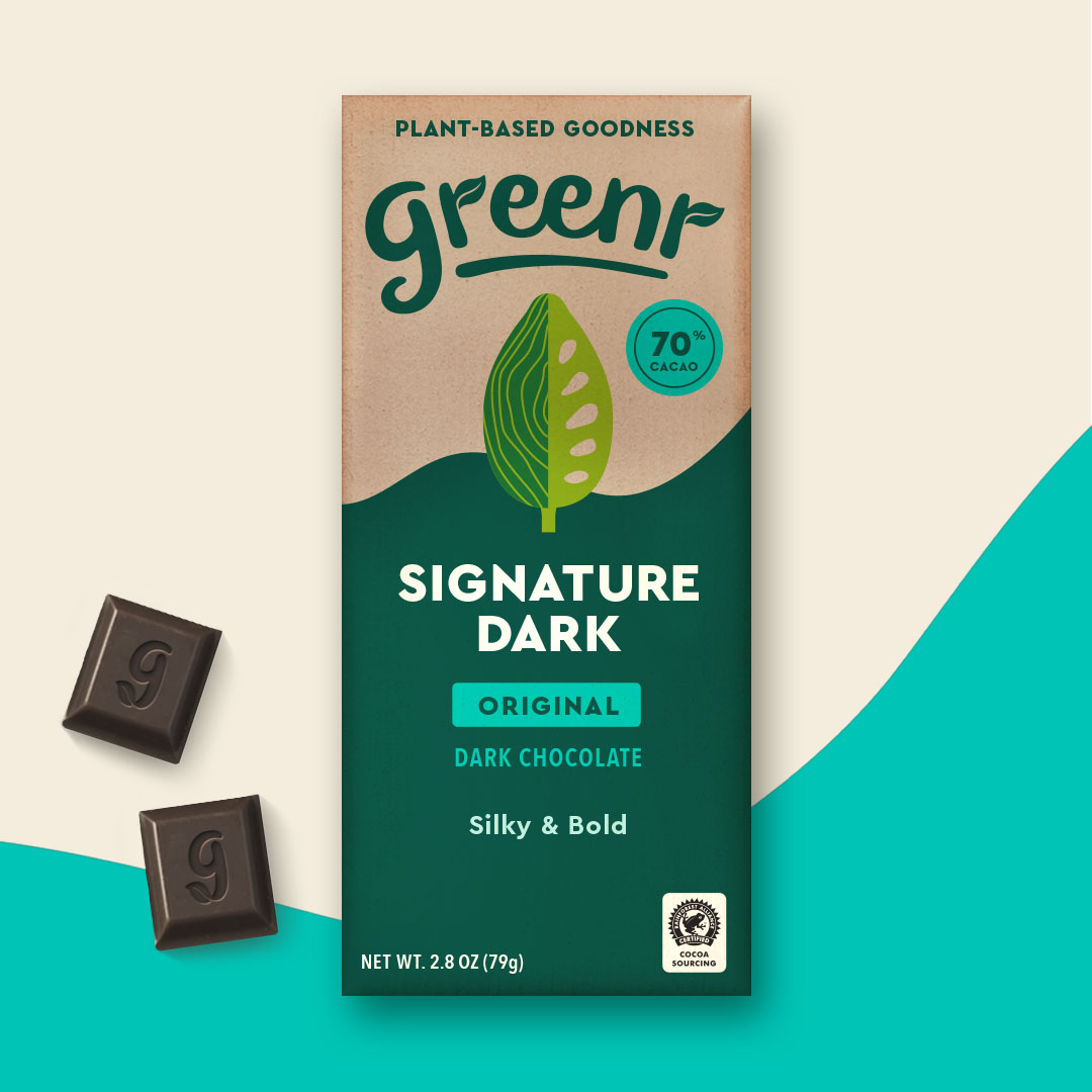
Another thing I like about Mottos designs are, the simple style they use and use of contrasting colours which they seem to use a lot. I have discussed that I want to do something similar with my festivals branding and the greenr chocolate packaging has given me some inspiration.
A designer which I looked at was Chip Kidd. Chip Kidd has focused a lot on creating book covers. This means that his designs have a large focus typography.


These designs give me a lot of inspiration for how I can set out the text for my poster. I am a fan of the wide range of ways in which he displays his typography and he has used many different methods. I am not sure yet on wether I want an illustration or photograph for the background for my poster. Looking at these designs has helped to give me ideas on how I can display text on a photograph or an illustration. Chip Kidd’s portfolio is so vast and varied that I enjoyed looking through his work and it was a great form of inspiration for me.
